SHRM FOUNDATION REDESIGN
THE CHALLENGE
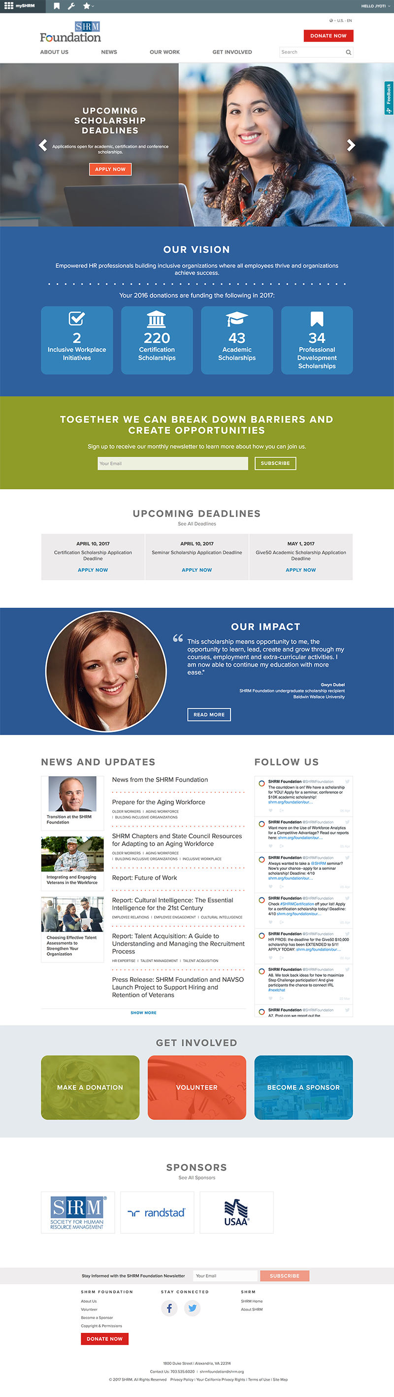
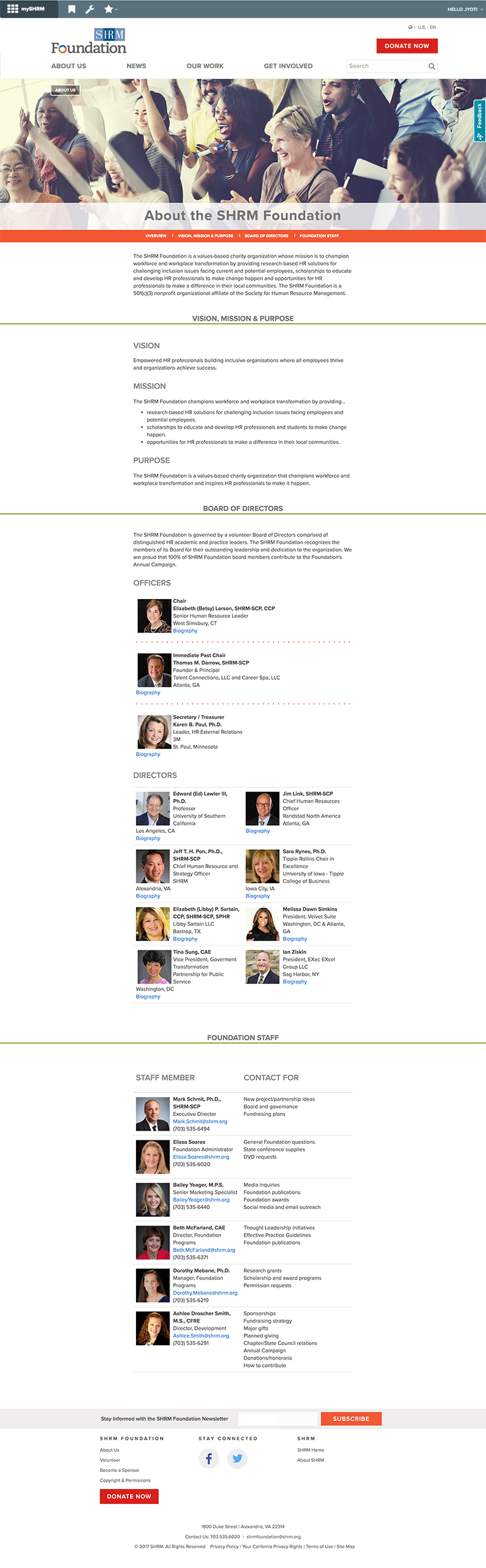
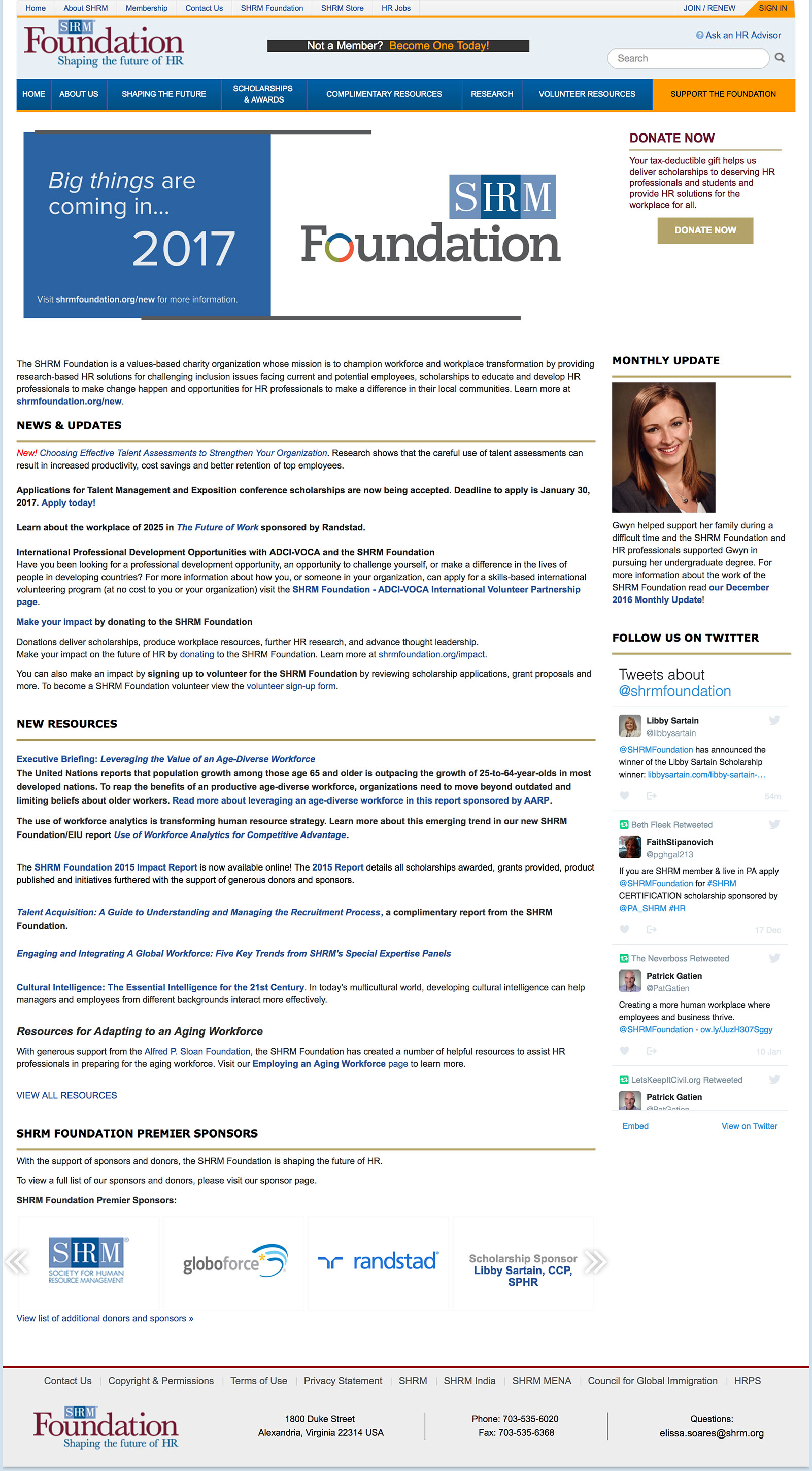
The SHRM Foundation was not attracting enough viewers to their website and worse, were not able to convert the visitors to donors. After extensive research, we concluded that the website was too corporate looking, with no personal touch. It also failed to address the mission of the foundation and how it was helping the recipients of grants and scholarships and the community at large. The new site needed to look like it was part of the SHRM brand, yet different enough to avoid confusion.
THE SOLUTION
Simplified the navigation for easier access to important information and got rid of extraneous links. Highlighted the mission of the Foundation and added graphics, icons, statistics to demonstrate the Foundation’s range.
Warm colors and photos of people to made the interface more friendly.
Interactive, response, high fidelity wireframes were created in Axure RP, and all color prototype was created in Sketch 3.
SHRMSTORE WIREFRAMES
THE CHALLENGE
The SHRM Foundation was not attracting enough viewers to their website and worse, were not able to convert the visitors to donors. After extensive research, we concluded that the website was too corporate looking, with no personal touch. It also failed to address the mission of the foundation and how it was helping the recipients of grants and scholarships and the community at large. The new site needed to look like it was part of the SHRM brand, yet different enough to avoid confusion.
THE SOLUTION
Simplified the navigation for easier access to important information and got rid of extraneous links. Highlighted the mission of the Foundation and added graphics, icons, statistics to demonstrate the Foundation’s range.
Warm colors and photos of people to made the interface more friendly.
Interactive, response, high fidelity wireframes were created in Axure RP, and all color prototype was created in Sketch 3.